 |


8. Frequency domain analysis
|
|
|
|
8. 1 FREQUENCY RESPONSE
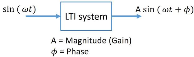
Earlier, we have discussed that there are several standard test signals used to study the performance of control systems. Out of these, the sinusoidal signal is perhaps the most important and the most useful. There's a good reason for that, and it's because of an interesting property of an LTI system, called sinusoidal fidelity. To explain sinusoidal fidelity, let's look at the mathematical operations associated with LTI systems. An LTI system can only be build using these or a combination of these operators:
Multiplication by a constant: f(t) x a
Differentiation of the input signal: 
Integration of the input signal: ∫ f(t) dt
Addition of two input signals: f1(t) + f2(t)
Why are these operations so special?? Let's try to find out, by providing sinusoidal inputs to these systems.
Let our sample sine input be: A sin t and the output of these operations will be,
Multiplication by a constant: A sin t x a = Aa sint …What do you know, the output is a sine wave. Just that the magnitude has just changed to Aa.
Differentiation of the input signal:  = A cos t = A sin(t +90)
You gotta be kidding me! Again a sine wave output. This time the Magnitude doesn't change, but there is a phase shift. You know we are going with this. That’s right, the other two operations also produce sine wave outputs.
We have observed something very interesting here, these outputs are all sinusoids, just that they have different Magnitude or phase or both. So the shape of the input and the output waveforms are the same (both sinusoids) for LTI systems. The only things that change are the Amplitude and Phase of the signal. This property is called Sinusoidal fidelity. In fact, this property is used to determine whether a system is LTI or not, practically.
A critical inference can be made from this property, that both the input and the output signals will have the same frequency components i. e. No frequency components can be manufactured other than the one's already present in the input signal (ideally).
This means that any linear system can be completely described by how it changes the amplitude and phase of cosine waves passing through it. This information is called the system's Frequency response. Just like our time domain transfer function, we can define a transfer function in frequency domain. The sinusoidal transfer function G(j  is a complex quantity and can be represented as magnitude and phase angle with frequency
  variable parameter. Such frequency domain transfer function can be obtained by substituting j
  for ‘s’ in our time domain transfer function G(s) of the system. When we are referring to frequency response, we are considering the steady state frequency response, so the term
  in s becomes 0, making s = j .

Magnitude of output = Magnitude of input x |G(j  |
|
Phase difference  =
=  G(j
G(j
So to get the frequency response means to sketch the variation in magnitude and phase angle of G(j , when  is varied from 0 to
  . Many methods like Bode plot, Nyquist plot, Polar plot and M-
  plot are used to sketch the frequency response of control systems. In the coming section, we’ll look into bode plots in detail.
|
|
|
8. 2 BODE PLOT
The basis of any frequency response plot is to plot the magnitude M and the phase against the input frequency  . When is varied from 0 to
  , there is a wide range of variations in M and and hence it becomes difficult to accommodate all such variations with linear scale. So this guy, H. W. Bode suggested that it’s better to use the logarithmic values of Magnitude for plotting against the logarithmic values of and came up with the idea of Bode plots.
A Bode plot is essentially 2 separate plots:
1. Magnitude expressed in logarithmic scale against logarithmic values of frequency . This is called the Magnitude plot.
2. Phase angle in degrees against logarithmic values of frequency . This is called the Phase plot.

8. 3 SKETCHING THE BODE PLOT BY HAND
Sketching the bode plot by hand?? Yes, I’ll give you this one, it is as crazy as it sounds. With the availability of software’s like Matlab, nobody these day’s bother to sketch bode plots by hand. The reason we included this section in this book is because, sketching a bode plot by hand (at least a few times) will give you a better insight into Frequency response of systems and help gain an intuitive understanding of the topic.
First things first you will need a semi-log graph paper. In such a paper, the X axis is divided in logarithmic scale (non-linear scale) and the Y axis in linear scale like a normal graph sheet. The interesting part about the X axis is that the distance between 1 and 2 is greater than the distance between 2 and 3 and so on. The distance between 1 and 10 (or 10 and 100 etc. ) is called a decade. Note that the first set of numbers goes as 1, 2, 3... the second as 10, 20, 30... and the next as 100, 200, 300... The best part about using a semi-log graph sheet is that a wide range of frequencies can be accommodated on a single sheet.
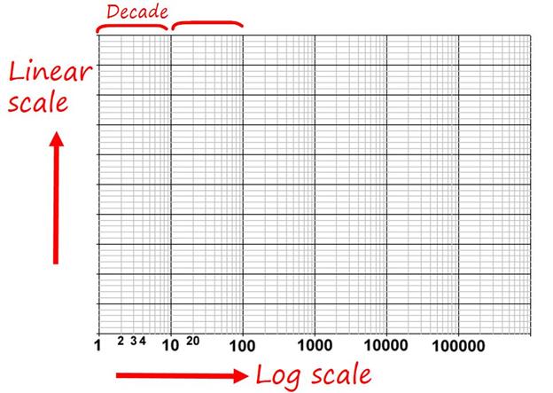
If you are still confused about semi-log graphs, it may be good idea to download a semi log template (link) and write in your own numbers as practice.
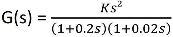
Consider an Open loop transfer function,

Therefore the Magnitude and Phase angle of G(j ) is given by,
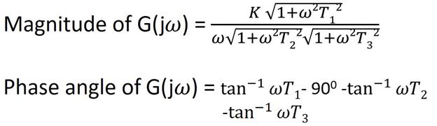
Because Magnitude is expressed in decibels (|G(j )| in dB = 20 log |G(j )| ), and for that we are taking log of individual magnitude terms, multiplication is converted to addition.

Hence in the Magnitude plot, the dB magnitudes of individual factors of G(j  ) can be added. Therefore, to sketch the magnitude plot, the knowledge of magnitude variations of individual factors is essential.
Basic factors that are frequently found in G(j ) are:
1. Constant Gain K:

2. Integral factor (K/s)

3. Derivative Factor (Ks):

4. First order factor in denominator (1/1+sT):

5. First order factor in denominator (1+sT):

8. 3 EXAMPLE
· Replace s with j to obtain sinusoidal transfer function.

· Find the corner frequencies and the slopes contributed by each term.
|
|
|

· Choose a frequency l lower than c1 (Say l = 0. 5) and h higher than c2  h = 100) and calculate the gains at these frequencies.

· Plotting the Phase plot is straightforward.


More Bode Plot Examples: Link
8. 4 BODE PLOT IN MATLAB
You can plot a very accurate Bode plot using just few lines of code in Matlab.
Example:

Matlab documentation for Bode Plots (Link)
|
|
|